I think the design will look great in reality and a blank block in between ARG and YLE will be absolutely fine. Looks nicely balanced to me especially as the lettering appears to start from the front row. And Argyle means more to me than Pilgrims.
You are using an out of date browser. It may not display this or other websites correctly.
You should upgrade or use an alternative browser.
You should upgrade or use an alternative browser.
-
 This site is sponsored by Lang & Potter.
Revised images and drawings
- Thread starter PL2 3DQ
- Start date
Well, I don't know for sure if The Hallets, (or whoever made the decision) got the idea from my mock up but I'm glad they've considered going with something similar.
I really disliked the PILGRIMS design and explained a few pages back why I thought it was important to get ARGYLE into our branding somehow.
Plus nobody has ever asked me "How'd The Pilgrims get on at the weekend?"... Because we're ARGYLE!!! :greensmile:
I really disliked the PILGRIMS design and explained a few pages back why I thought it was important to get ARGYLE into our branding somehow.
Plus nobody has ever asked me "How'd The Pilgrims get on at the weekend?"... Because we're ARGYLE!!! :greensmile:
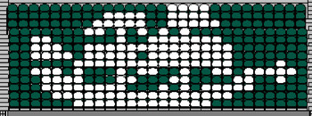
Ottawa Green":45lf4r63 said:There are 2 plans up on the wall in GOS pic 1, the first up in the top LHC shows the word PILGRIMS across the seats, the second plan in the middle of the wall has ARG YLE on the seats, there is no Mayflower in the middle, and i would think it would be impossible to get that design on the seats, if you look at the words PILGRIMS and ARG YLE, they are made up of whole seats so the lines are straight, your image of the Mayflower is made up of curves, diagonals, etc. the seats would have to be custom made and i imagine very expensive, it is a great idea but i dont think it is practical.
There are 7 sections in the Mayflower and we have 2 suggestions one with 8 letters and the other with 6, right now i dont like the 2 ideas PILGRIMS means you have to have one section with 2 letters and the rest with one letter and ARG YLE means you have a section with zero letters,
Yep, I tested out making a Mayflower out of just the white seats and it looked pretty awful and barely recognisable...
The actual block behind the dugouts has slightly fewer seats than the mock-up above also, so would look even worse in real life!
A neater Mayflower design would only have worked with custom etched/painted seats which would be complicated to arrange and more expensive to source and maintain...
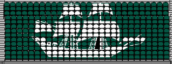
Both of these designs were only made to throw out ideas.
In reality a block made up of green, white and black seats either in stripes or even a random formation would be an acceptable way of breaking up the ARG and the YLE!
:thumbup:
Argylegames
Administrator
Staff member
🏆 Callum Wright 23/24
✅ Evergreen
Jade Berrow 23/24
🎫 S.T. Donor 🎫
✨Pasoti Donor✨
🌟Sparksy Mural🌟
dellaclearing":wjp1qf9c said:an acceptable way of breaking up the ARG and the YLE!
:thumbup:
Nobody breaks up the Argyle! :greensmile: :wave:
Argylegames
Administrator
Staff member
🏆 Callum Wright 23/24
✅ Evergreen
Jade Berrow 23/24
🎫 S.T. Donor 🎫
✨Pasoti Donor✨
🌟Sparksy Mural🌟
Ah! But they did!Emeraldinho":ar87ngw0 said:Nobody expects the Spanish Inquisition either! :lol:
The Inquisitors used to let people know they were coming.
Argylegames
Administrator
Staff member
🏆 Callum Wright 23/24
✅ Evergreen
Jade Berrow 23/24
🎫 S.T. Donor 🎫
✨Pasoti Donor✨
🌟Sparksy Mural🌟
I remember the sketch well. I find it more amusing knowing that the opposite was actually true!Emeraldinho":fu6bkzwm said:I think you may have missed my point!Perhaps you're not old enough to remember Monty Python?
ARG YLE with the gap looks absolutely fine, but personally I'm not sure about the white stripe in the upper tier.
Might make the stand look a bit 'busy' and possibly odd with it not being at the same level as the white stripe on the horseshoe.
We'll see soon!
Might make the stand look a bit 'busy' and possibly odd with it not being at the same level as the white stripe on the horseshoe.
We'll see soon!