You are using an out of date browser. It may not display this or other websites correctly.
You should upgrade or use an alternative browser.
You should upgrade or use an alternative browser.
-
 This site is sponsored by Lang & Potter.
(Thoughts on a) New Kit for 24/25 season?.
- Thread starter Keith Hennessey
- Start date

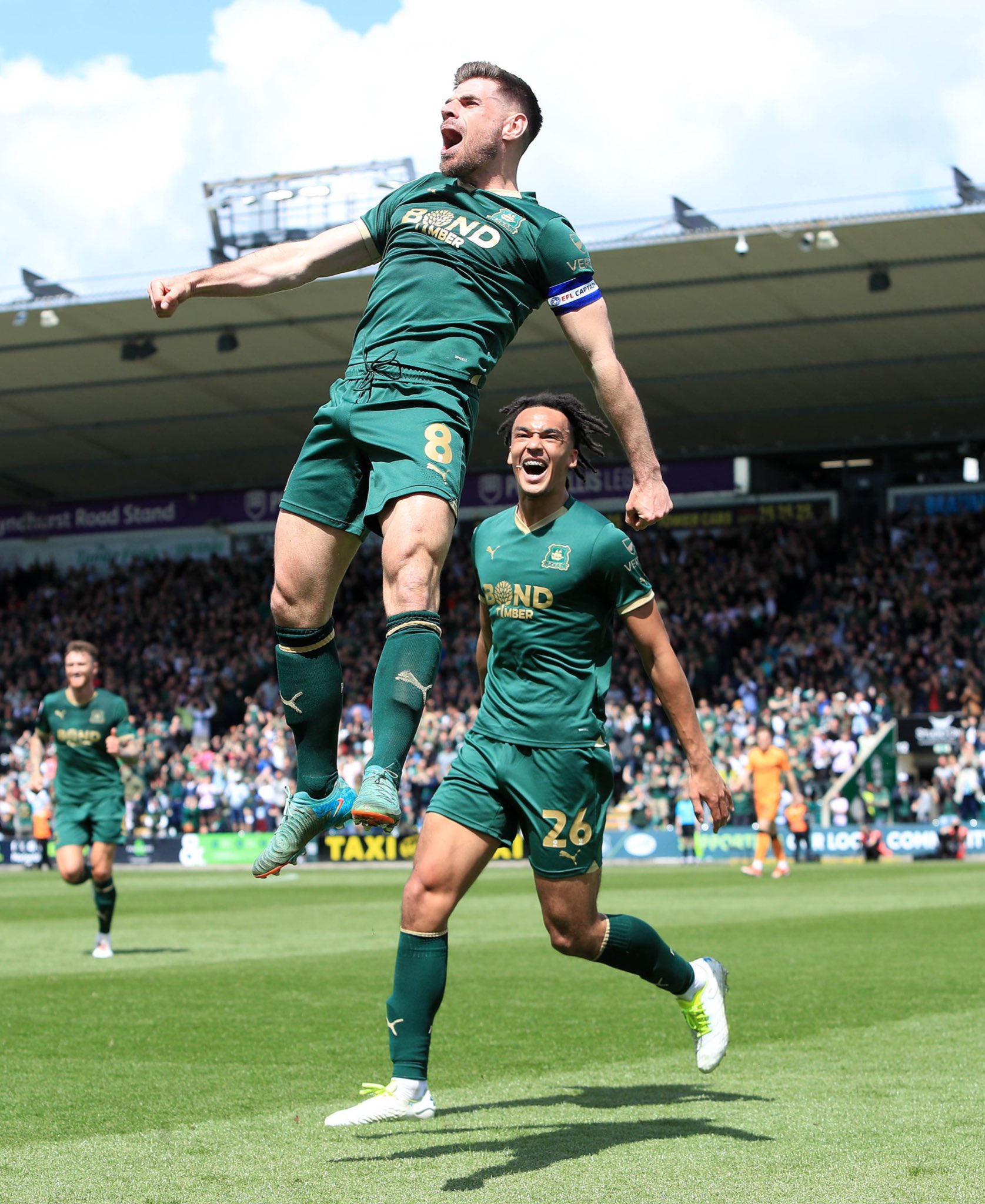
I absolutely love the Green and Gold, I'm just not sure about the Bond Timber.
That said, it's still better than having that Dustpan Pastry manufacturer on the shirt.
In terms of symbolism being of such great concern regarding the presence of the gold, perhaps we should take the point of symbolism and apply it in respect to this season - a trim of yellowy-brown to represent squeaky bum?
Keep the gold!
I'd love the club to be brave (they won't) and go for a predominantly white kit at home, with green and black trim around the collar and arms.
I am now utterly convinced that our poor home midweek (night) record is down to the camoflaugeness or our kit.
I am now utterly convinced that our poor home midweek (night) record is down to the camoflaugeness or our kit.

I have been supporting since 1962 (yikes that long!!)
The Green and Gold is the best colour combo I have seen.
Ditch the white and black bits , ditch tradition.
KEEP THE GREEN AND GOLD please.
The Green and Gold is the best colour combo I have seen.
Ditch the white and black bits , ditch tradition.
KEEP THE GREEN AND GOLD please.

Funny isn’t it, how opinions differ (very healthy of course). I suspect the current one (green and gold) will become a modern classic / collectors in the future but I really really don’t like it. Makes me think of the Springboks rugby team.
I’d like to go back to an emerald green, green and white stripes but this British racing green is where we are, and it’s not going to change.
Yellow away kit please, with some green trim (salivate)
I’d like to go back to an emerald green, green and white stripes but this British racing green is where we are, and it’s not going to change.
Yellow away kit please, with some green trim (salivate)
Surely this ( if it was even a thing) would be of more benefit than a hinderance. we wear the kit all the time and would get used to it. The opposition would almost definitely have a harder time with it ( if it was even a thing).I'd love the club to be brave (they won't) and go for a predominantly white kit at home, with green and black trim around the collar and arms.
I am now utterly convinced that our poor home midweek (night) record is down to the camoflaugeness or our kit.
I'm guessing that IJN is referring to our players passing to a teammate, sometimes you only get a brief glance before you have to play the ball, green shirts may make it that much more difficult to pick them out.Surely this ( if it was even a thing) would be of more benefit than a hinderance. we wear the kit all the time and would get used to it. The opposition would almost definitely have a harder time with it ( if it was even a thing).
It's the reason why Man U famously changed their grey shirts at half time. Fergie was mocked at the time for saying the players couldn't see each other in it but it appears there was some truth in it. Man U were working with a professor at the time who was convinced the grey shirts were a bad idea and it appears she was proven correct:
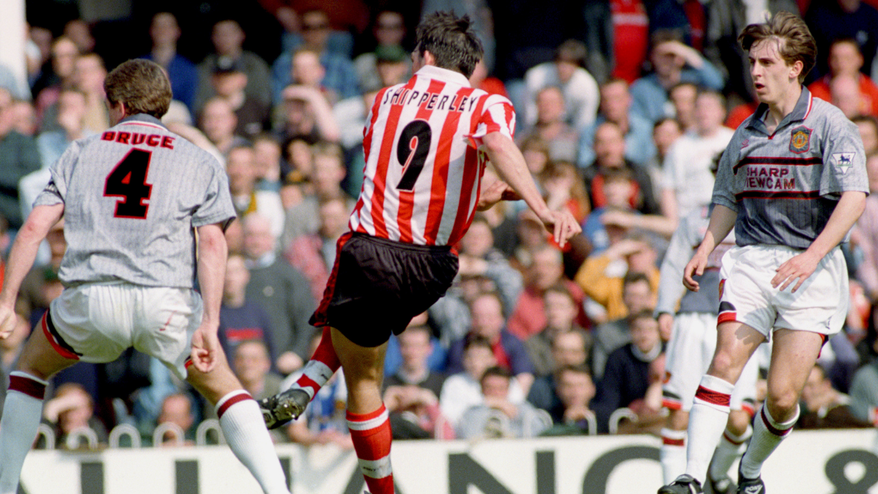
REMEMBERED | 25 years since Manchester United's grey kit fiasco
25 years ago this week, Manchester United entered Premier League folklore at half-time during a drubbing by Southampton at The Dell.
I always remember the streets of Plymouth as soon as Man U ditched the grey shirts and they were being sold off cheaply, they were suddenly everywhere!
On Saturday, even though they lost,I'd love the club to be brave (they won't) and go for a predominantly white kit at home, with green and black trim around the collar and arms.
I am now utterly convinced that our poor home midweek (night) record is down to the camoflaugeness or our kit.
I was thinking how much easier it was to pick out the Hull players in their orange ...even on a sunny day.
Why on earth did we change to that shade of green in the first place?
Spot on we need some white again ideally shortsI'd love the club to be brave (they won't) and go for a predominantly white kit at home, with green and black trim around the collar and arms.
I am now utterly convinced that our poor home midweek (night) record is down to the camoflaugeness or our kit.
If we are camouflaged then surely we are blind to the opposition as well.
Works both ways, doesn't it?
Works both ways, doesn't it?
I agree. That shirt was not in Argyle colours. Ok for one season but let’s get back to proper green!Surely the opportunity for us to ditch the drab green and gold.What about a proper green black and white kit for our tilt at the Prem in front of millions of Sky viewers..Any thoughts..
Horrible . Much preferred the away kit.I absolutely love the Green and Gold, I'm just not sure about the Bond Timber.
That said, it's still better than having that Dustpan Pastry manufacturer on the shirt.
In terms of symbolism being of such great concern regarding the presence of the gold, perhaps we should take the point of symbolism and apply it in respect to this season - a trim of yellowy-brown to represent squeaky bum?
Keep the gold!
Been beating the white kit drum for years Ian! Thanks for joining me 👍🏻I'd love the club to be brave (they won't) and go for a predominantly white kit at home, with green and black trim around the collar and arms.
I am now utterly convinced that our poor home midweek (night) record is down to the camoflaugeness or our kit.

Pointless going white at home.. it's against everything we have become. Our identity will be lost.Been beating the white kit drum for years Ian! Thanks for joining me 👍🏻