Having held consultation meetings with invited fans' groups and announced at the recent fans' forum that the new kit would be VERY popular, I'd be amazed if it were not a predominantly green (as in the current shade of green) home kit with a collar. The away kit would then be predominantly white (with or without a band depending on the sponsor's name requirements) and without a collar.We were promised a decision in the very near future ???
You are using an out of date browser. It may not display this or other websites correctly.
You should upgrade or use an alternative browser.
You should upgrade or use an alternative browser.
-
 This site is sponsored by Lang & Potter.
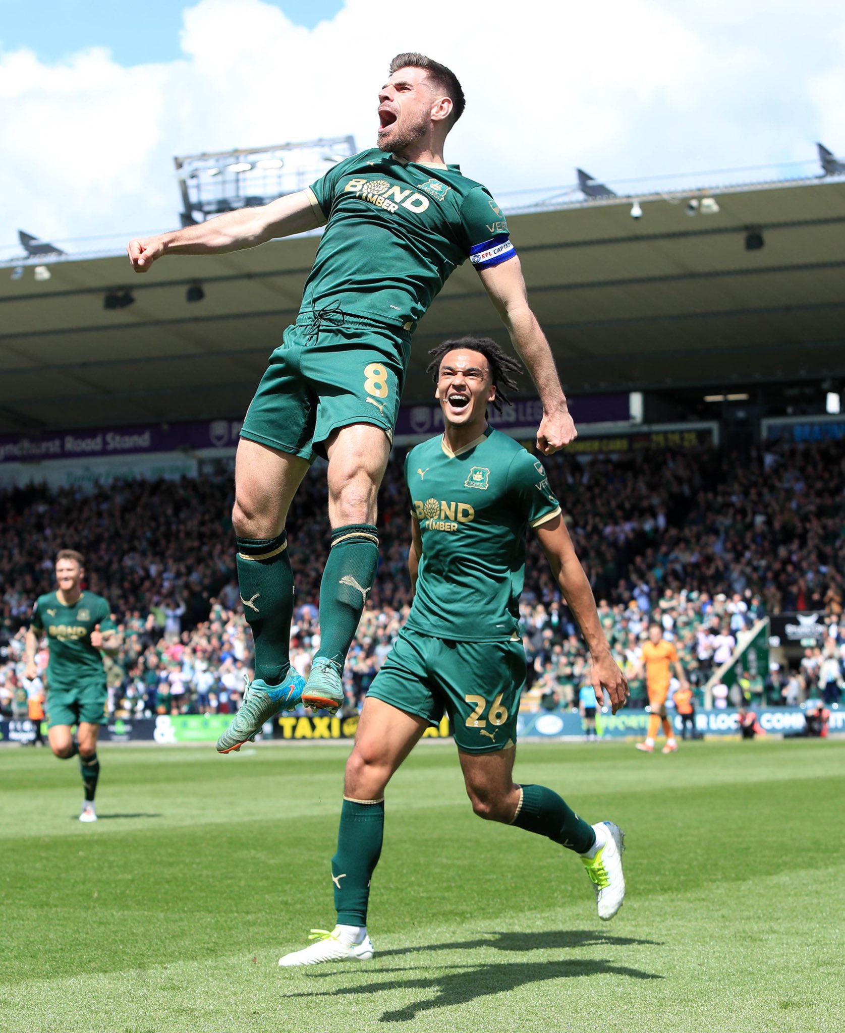
Next season's strip.
- Thread starter IJN
- Start date
I maybe the only one on here, but I would prefer white shirts at home (lighter green shorts, white socks).
Works better (for me) on so many levels.
Works better (for me) on so many levels.
Lousy_Pint":aefa2mnn said:I maybe the only one on here, but I would prefer white shirts at home (lighter green shorts, white socks).
Works better (for me) on so many levels.
Erm, we're not Leeds Utd.
")
L
lambanog
Guest
This exercise of changing strips every year is nothing more than a money maker. And the money comes from the fans. Just a question, what would happen if the shirt sponsors disagreed about a change of shirt next season, as they are happy with what the team wears now ?
Knarf Reprah":2pbectko said:Proper Argo green please Bob, not the current dark green
Not gonna happen Frank. Argyle stated it'd only change if/when the wider club livery changes (ground paint, signage, ticketing and merchandise colours etc.). I just can't see there being enough money sloshing about currently to do all that.
I prefer the current green but a greater enemy has surfaced in recent seasons, the tradition insulting rainbow away kits. So if we were to go to a lighter green whilst only using green, black and white at home AND away, i'd raise no objection.
Lee wsm. Nothing personal but those iconic strips cannot be outdated because the simplicity of the design makes them timeless.
bringonthemilkman":kq05oq78 said:Lee wsm. Nothing personal but those iconic strips cannot be outdated because the simplicity of the design makes them timeless.
if it was more of a chest stripe with puma logo and badge like normal rather than being lower down and just a big badge it would look fine to me.
Lee. I think you're interpreting the artists impression on the ST literature a bit too, well, literally.
I too thought that drawing was a little odd, the band is too low and looks like a cummerbund.
But it's only a drawing, a cartoon, it's not the real thing. It's got no sponsor logo, no manufacturers logo and no collar. I've resolved therefore to wait to cast judgement until the actual shirt is revealed, for all we know it may not even be the 60's banded design at all.
Opinions are wonderfully diverse on all things but let's wait until there's actually something upon which to have an opinion first. To do otherwise would be like commenting on someone's face based on their police photo fit.