Away kit revealed | Page 8 | PASOTI
  • This site is sponsored by Lang & Potter.

Away kit revealed

Do you like the new away kit?

  • Yes

    Votes: 111 49.1%
  • No

    Votes: 81 35.8%
  • Undecided

    Votes: 27 11.9%
  • Not bothered -'meh'

    Votes: 7 3.1%

  • Total voters
    226

Biggs

Administrator
Staff member
✅ Evergreen
✨Pasoti Donor✨
🌟Sparksy Mural🌟
Feb 14, 2010
12,902
6,562
Plymouth/London
IJN":28b4zeg5 said:
FFS Biggsy!! These companies sponsor us to give themselves 'coverage'. What the hell is the point of them changing their logo?

Give these people some credit, it's their money, it's their logo, and I love the fact that they contribute to the club's coffers.

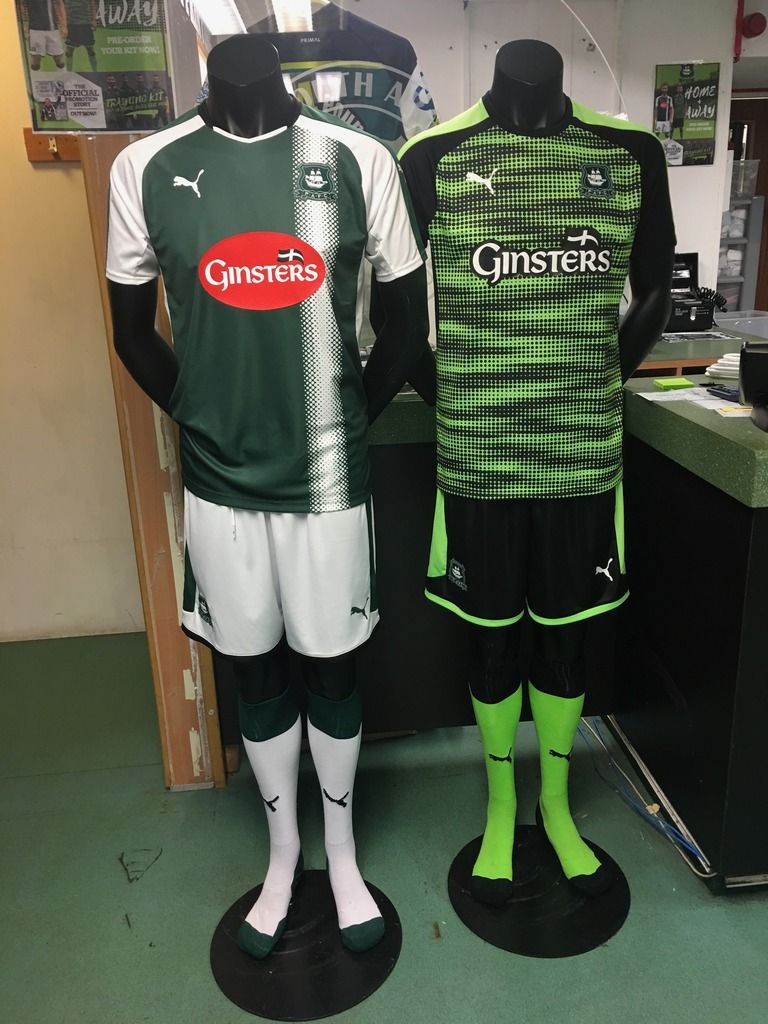
I'm aware it may sound ungrateful, but I thought the shirt looked really good before, and now I don't because of that sponsor. I am also aware that I am probably one of the few human beings sad and 'OCD' enough not to buy something because I don't like the way a small sponsor looks. And then post on an internet forum about it!

Having said that, I always thought that the better a sponsor looked, the better it reflected on the company and the more likely a potential customer might check them out. Seems a shame that we've worked closely with Ginsters and the university to make them and us look as good as possible, but perhaps not with the good folk at Firebird.
 

llcoolgee

🇦🇺🇦🇺🇦🇺🇦🇺🇦🇺🇦🇺
Mar 10, 2011
187
190
Melbourne
The worst kit in our history! How the club can sanction/sign-off on that garbage is beyond. Truly, truly awful.
 

Lousy Pint

Jam First
Sep 23, 2005
2,114
1,011
Milano
I'm not voting yet because I can only see it at smartphone size. I'll have a gander on me pc tomorrow.
However, first thoughts:
Love the shorts and socks and the shirt sleeves,
Can't make out what is going on with the torso,
Really don't like the club crest on that background,
Well done Ginsters again! (tho' I don't have a prob with the blob),
I'm hoping the torso will look better larger, really want to vote yes.
 

Keith Hennessey

🇳🇿🇳🇿🇳🇿🇳🇿🇳🇿🇳🇿
Jul 17, 2006
2,520
493
73
Blenheim New Zealand.
I can live with the fact that we are stuck with this kit for the next season. Now here is the thing that really grinds my gears.
Yes the kit is bright , but thats not a bad thing at all , what will IMO make it really smart is that everyone is made to wear black boots. If as in previous years players turn up with every different coloured boot imaginable it will look a nightmare. (IMO)
 
Jan 27, 2012
3,917
994
I wonder if the club would consider a limited edition re-run of last season's away kit if the new one doesn't sell too well? That was a cool design.
 
Aug 24, 2014
1,604
604
Plymouth
gaspargomez":1dj7bwk0 said:
I wonder if the club would consider a limited edition re-run of last season's away kit if the new one doesn't sell too well? That was a cool design.

I'm glad I got last years, although I'll probably get this one too.

I like the home ones, but the red blob is too much.
 
Jul 29, 2010
13,412
2,957
petersm":zdbxi0uq said:
Anyone got a link showing a pic of the back of the shirt?
It's not a great image but it's in a facetw@tter link at the back end of the 'DA has gone AWOL' thread. I had to take a shower after viewing the link, if I copied the link I might need a course of sheepdip :lol:

I ordered mine online earlier and there are a couple of other views in the kids and ladies shirt being modelled. All are front on only but there was enough there to confirm there are indeed again three bleddy Puma logos to our one :roll:
 

Forest of Dean Green

✅ Evergreen
✨Pasoti Donor✨
Mar 5, 2009
3,375
2,505
Gloucestershire
X Isle":1rr66xt9 said:
petersm":1rr66xt9 said:
Anyone got a link showing a pic of the back of the shirt?
It's not a great image but it's in a facetw@tter link at the back end of the 'DA has gone AWOL' thread. I had to take a shower after viewing the link, if I copied the link I might need a course of sheepdip :lol:

I ordered mine online earlier and there are a couple of other views in the kids and ladies shirt being modelled. All are front on only but there was enough there to confirm there are indeed again three bleddy Puma logos to our one :roll:[/quote

X Isle, I can't help be a touch disappointed in you. I've always had you down as a man of sound bearing, speaking truth to the overwrought mitherings of the Pasoti hive mind. But you bought one of these shirts? They are an abomination man! It's like some who has drunk a crateload of limeade has hughied it all up over a cheap black shirt. It's a brash vomit of a shirt. It's as bad as Ryan Dinaldson's hair was at the start of last season. It's a pink boot of a shirt. Wake up man. Give yourself a slap. Have a cold bath.
 
Jul 29, 2010
13,412
2,957
The line of disappointed individuals is long my friend :lol:

I very much doubt it'll ever see the light of day, and certainly not on me. It is destined for the wall of the man cave. I like distinctive and it just makes me smile, one of those shirts that will live long in the memory, unlike the home shirt which will be forgotten by this time next year.
 
Mar 29, 2017
113
0
Both on display in the shop.

As first thought, the away looks much better in person, but still unsure if I like it.

Sadly looks like that Ginsters badge on the home top might not have been photoshopped after all...

Loving the home either way :)

IMG_5324.jpg
 
May 4, 2012
5,814
1,243
Sunderland
That's definitely a smaller logo than the one on the initial picture. Think both shirts look a lot better in that image that the original ones.